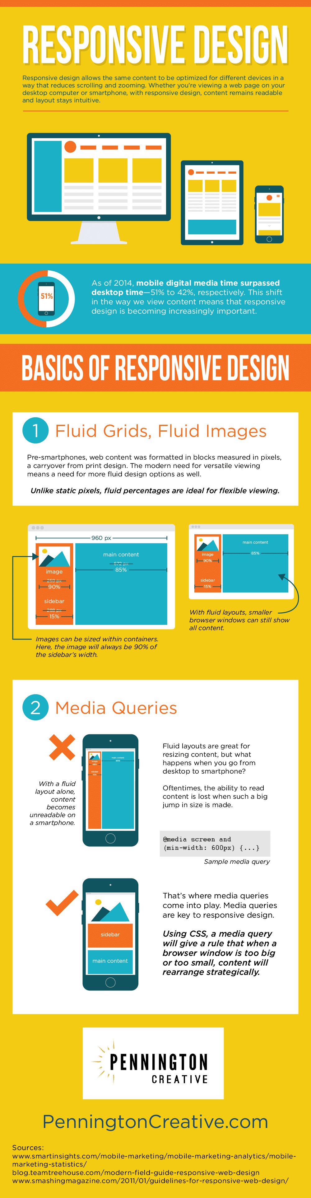
How can you ensure that your website will look great no matter what type of device is used to view it? Responsive design is the answer! With this technique, web pages become fluid and flexible, ensuring that the size and layout of items on each page are optimized for viewing whether they are seen on a smartphone or a desktop computer. Read through our latest infographic to discover more facts about responsive design.
Would you like to learn about Pennington Creative’s design and content services? Contact us today!
Save